I will be pleased to advise you.
Anneke Schmeer, Customer Success Managerin
Project goals
Creation of a modern, clear design
Intuitive user guidance
Development of a corporate design
Our customer, BIG direkt gesund, is Germany's first direct health insurance company. This means that the health insurance company deliberately dispenses with an elaborate and large branch network and instead focuses on self-services for individual policyholders. This is why a functional and modern online portal is extremely important.
BIG direkt was founded in 1996 and today has over 414,000 policyholders nationwide. The online portal to be replaced was last given a visual overhaul in 2015 and is now to be taken to the next level conceptually and graphically following a move to the Drupal CMS. A particular challenge here is the focus on long-standing existing customers: familiar services are to be revised, but still fit in visually with the customer. In addition, usability and user guidance are to be significantly improved. brainbits and its team of certified Atlassian experts offer tailor-made support packages for your environment for all operating variants - cloud, server or data center.
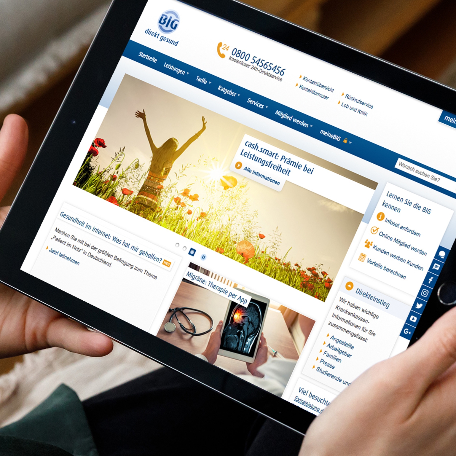
Before
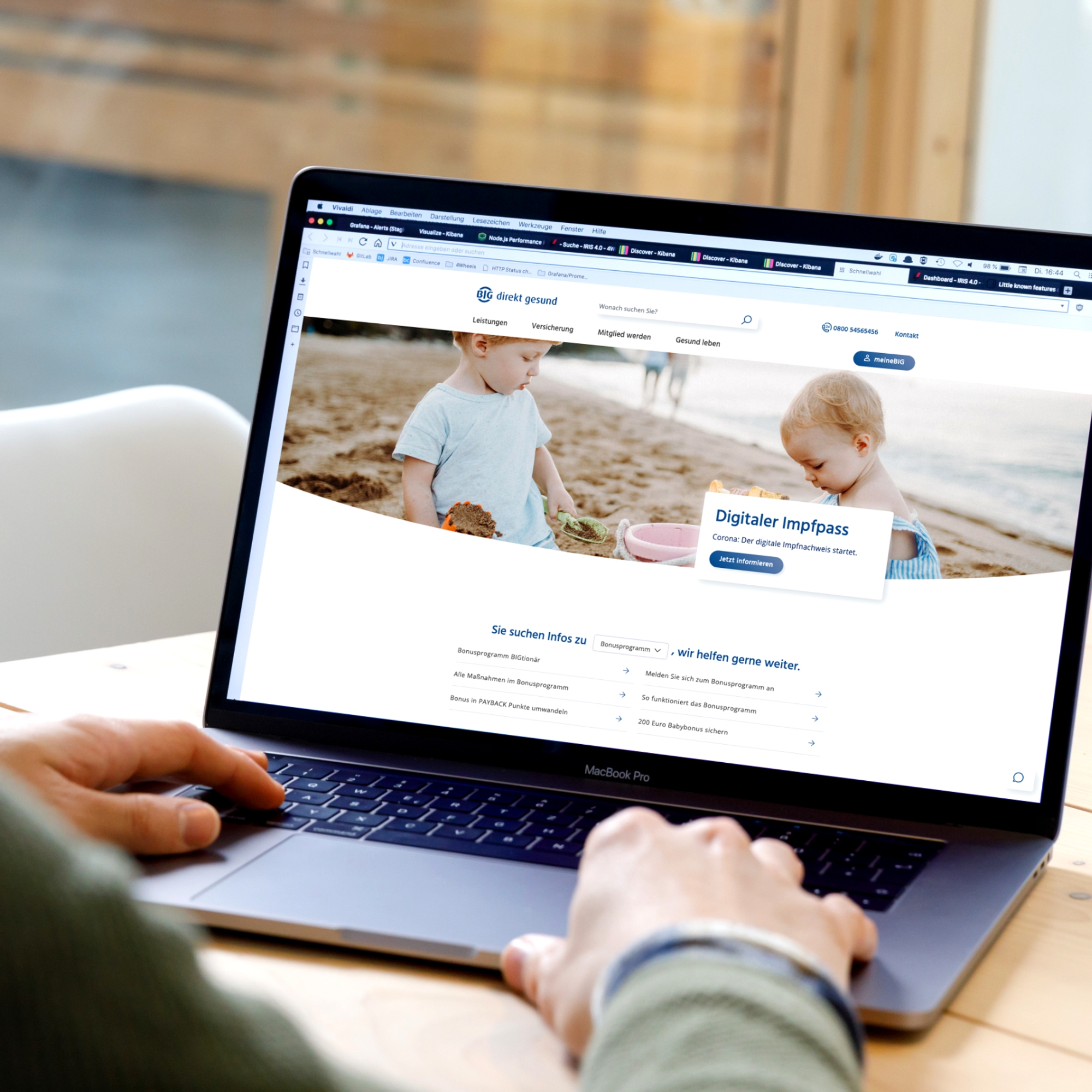
After
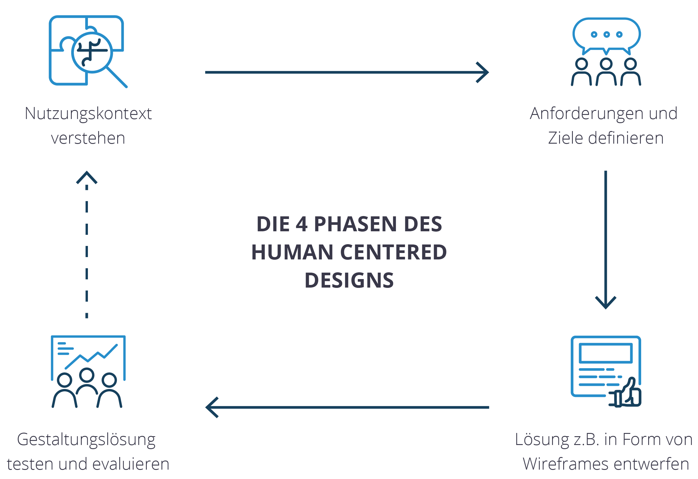
Our approach: Human Centered Design
As the name suggests, human-centered design focuses on people. When designing a digital product, every individual who comes into contact with the product is considered. This includes users as well as stakeholders such as management, marketing and editorial staff.
The aim is therefore to create a product that is intuitive to use and takes all requirements and needs into account in the best possible way. This ensures that the end product meets with a high level of customer satisfaction and is also well received within the company.
The development process in human-centered design can be divided into four phases:
Understanding and describing the context of use
Definition of usage requirements
Drafting the design solution
Testing and evaluating the design
This iterative approach can be perfectly integrated into an agile workflow.
Target definition
In several workshops with the customer (with participants from many specialist departments), we jointly developed a target package for the relaunch project.
The focus is on the insured person - this goes hand in hand with the company-wide objectives of BIG direct. A great deal of attention is paid to the protected area of the website with the self-services for insured persons, which is to be particularly strengthened.
The following targets were also set:
Revision and modernization of the design based on the corporate design manual
Structure of a web style guide
Improvement of responsive behavior on small end devices such as smartphones
Simplification of user guidance and thus increased usability
Standardization of page types and content
Personas and customer journeys
The content and services should be primarily geared towards the needs of BIG policyholders. Representative user and patient journeys are taken into account. The focus is on a targeted presentation of content and services for insured users of the website.
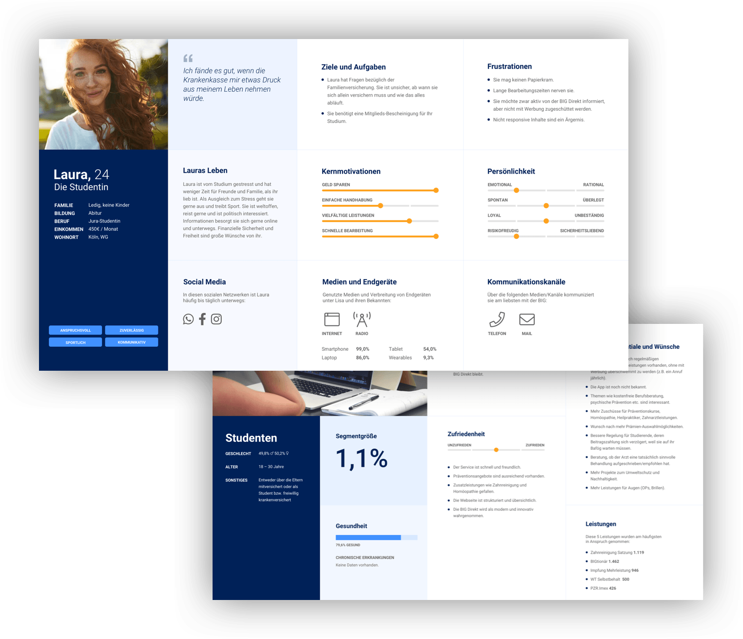
BIG's customer and policyholder base was analyzed and examined directly as a basis for this. First, we collected as much data as possible from various sources in order to create an accurate picture of the customers. This included evaluating service requests from the customer center, data from various customer satisfaction surveys, transcripts from focus group interviews and comprehensive click-tracking analyses. Based on the data, we developed customer segments that were as selective and representative as possible. In a further step, personas were created in several workshops with participants from UX, design and analytics to give the customer a face.
In the next step, we developed comprehensive customer journeys to match the personas in order to gain a deeper insight into current problems with the website and its services. The information from the focus groups was particularly important here in order to identify frequent inquiries and processes. The customer journeys were then recreated in collaboration with the specialist departments and the customer center in order to obtain as authentic a picture of the processes as possible. All conceivable contact points along the way were also taken into account - both online and offline.
Wireframes & conception
In close cooperation with the digital unit and the specialist departments of BIG direkt, numerous wireframes were created to show the new, adapted content structure of the pages. The findings from the previous phases had a major influence here.
Of course, this step also took into account the needs of the editors, who will have to create the new pages and fill them with content in the future. As a result, numerous benefits pages were created to explain the health insurance company's portfolio of services to (potential) policyholders. Particular attention was paid to presenting the benefits and exclusive services for policyholders in a way that is easy to grasp.
Another topic in the course of the relaunch was the revision of the health insurance company's so-called service tools. These are functional elements of the website where insured persons can search for doctors or medical aid contract partners, for example. Various calculators are also offered, e.g. to calculate the amount of the health insurance co-payment. These are designed to provide insured persons with a convenient and stringent user experience that follows the same rules across all pages.
Design-development
The major challenge in developing the design was to present the content in a structured and tidy manner. In addition, the portal should of course be easy to use on all end devices, whether computer or smartphone. We wanted to create a modern and responsive design that would also ensure our client's recognition.
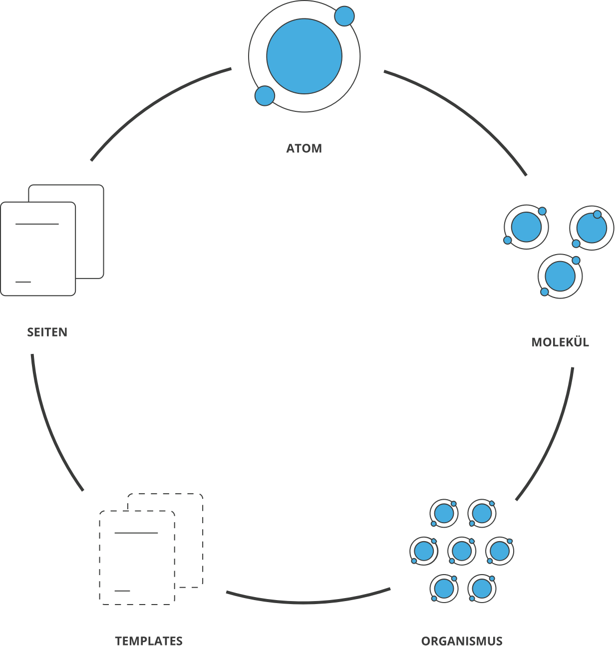
Our solution for this was found in Atomic Design. This approach originally comes from development. The big picture can be split into its smallest individual parts: the atoms. When these individual parts come together, they form molecules or even entire organisms, which are then used to create templates and pages. We started by creating mood designs to create variations of sample home pages and performance overview pages. This gave us a feel for the right color choices, a revised design language and the right image selection. Once the basic design guidelines had been defined in close consultation with BIG, the fine-tuning began. For example, the font formatting and colors were tested and defined on different devices and with real customers. Molecules such as links and buttons were then derived from this. These elements were then used to create larger units such as text and teaser boxes, sliders, accordions and other functional elements.
Atomic Design: Molecules and organisms
We were then able to fill the individual pages from this growing construction kit. The advantage of this approach is the resulting uniformity. If a small element (atom) is changed, all elements containing this atom are automatically adapted. This minimizes the development effort considerably, changes can be implemented very quickly (even later) without losing sight of the overall picture.
To prevent the site from appearing too sober and cool through the use of white space and the few accentuated colors, all elements are rounded and a curved arch is used as a formal element. This can also be found in the print advertising material, but has been reinterpreted for the web. Large, high-quality images are also used. These are very high-contrast and saturated in a reportage style. These motifs make everything appear more tangible and “right in the middle of life” - in keeping with the image of a direct health insurance company that wants to position itself close to its policyholders.
Another style element is the shadows derived from the Neumorphism design. This style works with a “light” shadow in the top left-hand corner and a very soft, sweeping shadow in the bottom right-hand corner. This makes the elements appear to almost float on the surface. The advantage of this is that it creates more depth in the design. We have deliberately only used these shadows partially, especially for clickable elements. This also supports good usability, as users can immediately recognize the interaction elements.
The result of the relaunch is impressive: A lot has changed, especially in the header and page structure. Irrelevant information has been removed, which has freed up a lot of white space. This makes the portal look very airy and modern. This impression is supported by the fact that the use of excessively blue areas has been avoided and shades of gray have been used instead. The secondary color orange is now only used for call-to-action elements. This means that the user can quickly grasp the page, but sticks to the central content and interaction elements and is easily guided through the portal.
Talk to our experts
